Uber Data Export Dashboard

What type of insights can I get from an Uber account data export? That is what I thought when a friend of mine shared that he had downloaded his Uber data and done a quick Excel math and noticed that he had spent thousands of dollars on rides and food ordering.
The first thing that I did was ask him for the data. Then I looked at the information it had. I find out it would be fun to make a data dashboard on it, so I meet with my friend, and we shared ideas on it and started working.
Having an idea of what I wanted to do but not how to do it was the reason I started a course on data science and visualization. That course helped me understand what I would be able to do using Python and the data I had.
That was what I did on the first week of this project: gathered ideas on what to work on, the tools we would use on it, and the insights we wanted to get from it.
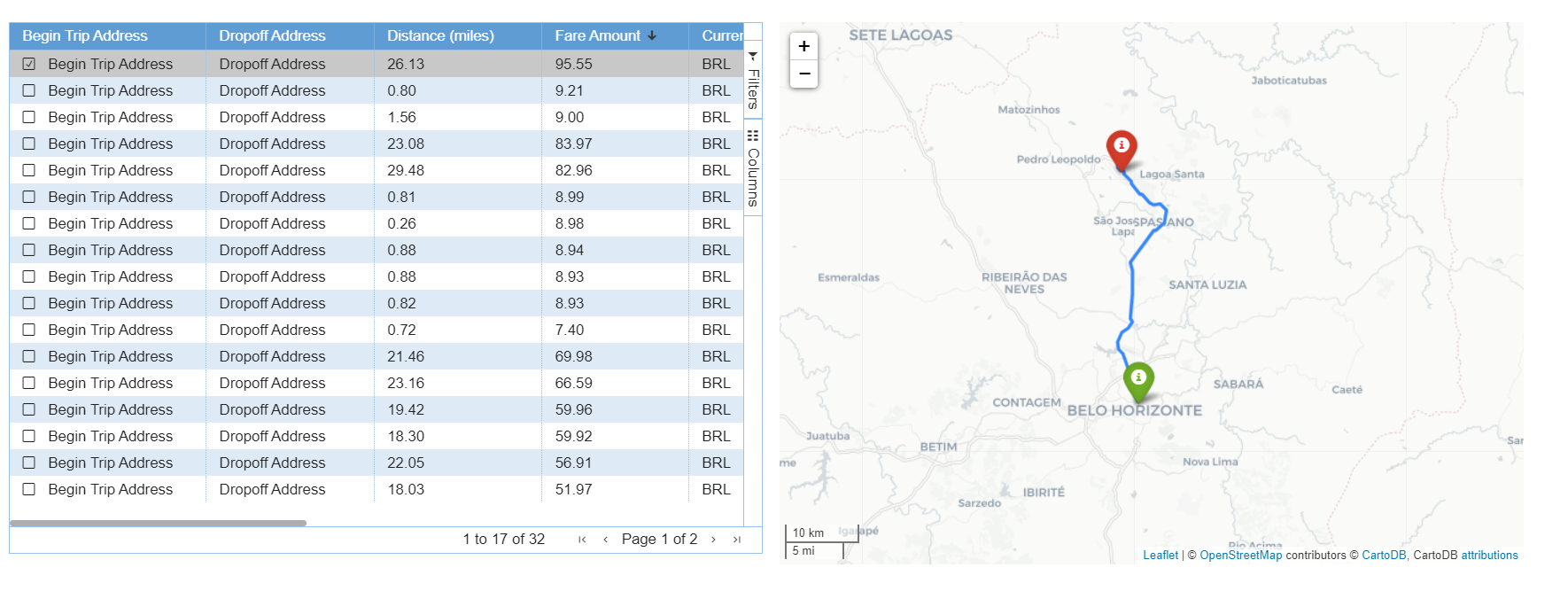
The first component I started working on was a table. There I wanted to be able to select the data I wanted to see, to order and filter the data. For that goal, I used streamlit-aggrid, a streamlit component built on top of AG Grid (Agnostic Grid).
Besides that, I also wanted to be able to select and store information, which was also supported by this custom component. I decided to use it to plot a map of the route made on that selected trip. For that goal, I used Folium and the route service openrouteservice, which is based on Open Standards and Open Geodata.
Then, I got to my first component: a table where I have pagination, sorting, filtering, and selection, and a map. From that component, my friend was able to know the most and less expensive trip, select the currency of the fare amount, hide and show some columns according to what he wanted to see, and also select a trip and see the route taken. These are just some of the functionalities that I show in the following video: